Loft Lines — Journal

Journal

Notes from the Studio — on paper, light, and rhythm

Essays and field notes from our bench in India. We test what lasts: lines that breathe in heat, paper that holds ink, frames that disappear.

Paper rolls stacked in a warm studio corner
Paper rolls — beginnings of a wall story.

A poster behaves like a quiet guest. It shouldn’t dominate the room; it should finish a sentence the furniture started. In these pages we document tests — some fail in interesting ways, and we keep them as warnings.

If you live with concrete, glare is an opinion. If you live with wood, warmth is a promise. Our job is to keep both gentle.

Ink brush and small dish on a dark desk
Ink tools — cadence lives in the wrist.
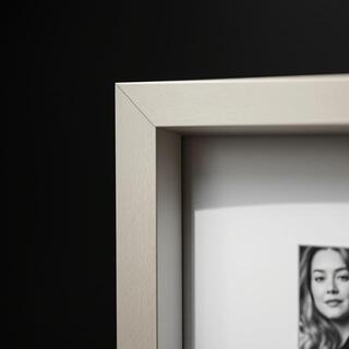
Frame corner with shadow gap
Shadow gap keeps glass off the print.

Field

Field Notes — three small lessons from recent installs

Short reads from Mumbai, Pune, and Chennai. The rules repeat; the rooms don’t.

Mumbai: balcony glare

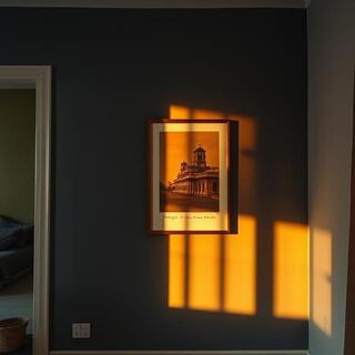
West-facing glass scorches a wall for twenty minutes at dusk. A matte stock and a 2–3° frame tilt killed the flare completely. We kept gaps tight (4–5 cm) so the triptych reads as one voice.

Wall catching dusk light in a Mumbai apartment
Dusk test — tilt wins against glare.

Pune: small entry calm

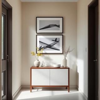
Two tall posters softened a noisy shoe zone. We placed centers at 153 cm and kept the lower edge 8 cm above the console. The entry suddenly felt like a pause, not a hallway.

Pune entry with stacked posters
Entry stack — pause before the house.

Chennai: AC & humidity

AC vents above frames create fine dust trails on glass edges. Felt spacers and semi-matte glazing kept it neat. Heavier 260–300gsm paper stayed flatter across monsoon weeks.

Frame near AC vent with spacers
Spacers + semi-matte — tidy edges.

Essay

The Room Is a Rhythm

A room is not an inventory of objects; it’s a tempo stitched by distances. Posters are rests — they make the furniture’s melody legible.

Every decision about a wall is a decision about rest. We try lines that almost touch, then pull them back. A poster’s value is not in its complexity but in the way it allows space to breathe.

On install days we measure more than we talk. The measuring tape is not a ruler; it’s a metronome. The right height is the one that keeps the rhythm of the room, not the rule from a book.

“Place the center where your attention lands when you exhale.”

We avoid loud frames. Thin black lines, teak when warmth is needed, steel when the room runs cool — each choice is an accompaniment, not a solo. If the print steals focus, we failed the room.

Essay

Palette for Heat — sienna, slate, and the honesty of light

India is a patient teacher: noon punishes glare, evenings forgive, monsoon air softens edges. Our palette is not a trend; it’s survival with grace.

We keep three notes on the bench — sienna, slate, and coal. Together they behave like reliable friends in a room that changes mood twice a day. Sienna gives warmth without shouting; it makes concrete less stern and steel less surgical.

Slate is the pause. When a wall already speaks — textured plaster, patterned fabrics, a busy bookshelf — slate receives light instead of reflecting it, like a river that decides to flow quieter under a bridge. On proof days, we put slate beside teak and glass. If both materials can shake hands there, the room will be easy.

Coal is not a color; it’s a promise to keep lines clear when everything else is polite. Thin black on matte paper reads like a whisper that you still hear across the room. We use coal to draw attention without appetite — the frame doesn’t need to raise its voice to be certain.

The rule we return to: treat light as a material. A poster that survives harsh noon on a white wall will feel generous at dusk on the same wall. If a color only works at 7 p.m., it’s not a friend; it’s a guest. Our job is to design for the host — the wall, the furniture, the life between them.

In practice, this means rejecting many beautiful things. Lustrous coatings that look luxurious under studio lamps perish in balcony glare. High-saturation inks thrill for a week and then tire the room. We keep the notes that age well, the ones that still feel inevitable when the house gets quiet.
Process

Mistakes We Keep — outtakes that became teachers

Not every line deserves a wall. These three didn’t — and that’s why we keep them near the printer.

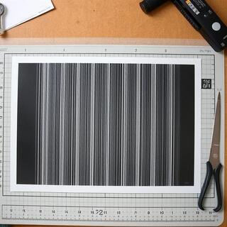
Poster with visible banding lines
Banding. We re-profiled the printer and slowed the pass; lesson: never rush a calm line.
Poster with blown highlights from glossy coating
Blown highlights. Gloss charmed in-studio, screamed in windows; matte won.
Frame with slight warp on a corner
Warped corner. Heavier stock + better spacer; the wall forgave us next time.

Materials

Material Ledger — quick glossary from our bench

Tap a term to highlight examples; fewer words, clearer choices.

Timeline

From Wrist to Wall — a week in the studio

What actually happens between a first gesture and a print on your wall. A quiet loop of testing, trimming, and checking.

  1. 1) Wrist & cadence

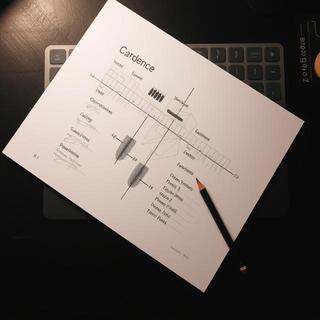
    We chase rhythm on thin stock. Ten tries, one keeper — pressure falls off in thirds, edges breathe.

    Cadence sheet with graphite strokes
    Cadence sheet — choosing the keeper.
  2. 2) Proof wall

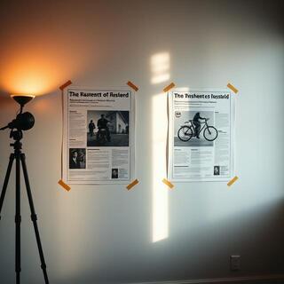
    Two papers under two lights: warm 3000K and noon daylight. We pick the calmer read, not the flashier one.

    Proof wall with two papers under different lights
    Proof wall — light tells the truth.
  3. 3) Frame & clean

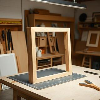
    Mats cut, spacers in, corners checked. We tilt the frame 2–3° to test glare before packing.

    Frame bench with mat and spacer
    Bench check — tidy corners, calm glass.

Q&A

Paper Q&A — five fast answers

Short, useful, tested in Indian light.

Matte or semi-matte?
Matte and semi-matte swatches side by side
Matte kills glare; semi-matte keeps a soft snap.

Bright rooms: matte. Dim corners: semi-matte. If you face west, matte + slight tilt wins.

What weight (gsm) lasts?
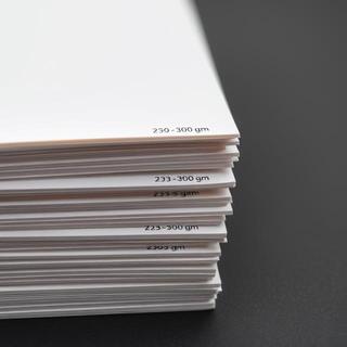
Stack labeled 230–300 gsm
230 gsm for small, 260–300 for large frames.

Coastal homes: prefer 260+ gsm to keep frames square through monsoon swings.

Do deckle edges need mats?

They look best with mats; the soft shadow needs breathing room.

How to clean glass?

Microfiber only; mist the cloth, not the glass. Avoid ammonia on AR coatings.

Mail

Artist Postcards — small notes we send out

Occasional postcards ride with orders — line studies, tiny grids. Save them, frame them, or pass them on.

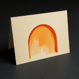
Postcard with sienna arc study
Arc study — sienna on kraft.
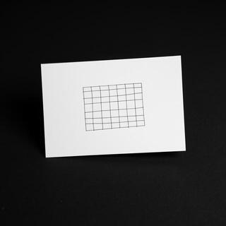
Postcard with small graphite grid
Mini grid — graphite cadence.
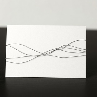
Postcard with thread-like ink lines
Thread lines — a quiet weave.

Tip: two postcards in one thin frame read like a quiet diptych above a desk.

Tools

Tools We Trust — simple kit, consistent results

The bench is quiet on purpose. A few tools, used well, beat a drawer of gimmicks. These are the ones we keep within reach.

Color checker and warm bulb for proofing
Color & light — checker + 3000K bulb for honest proofs.
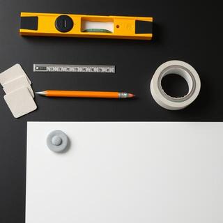
Hanging kit with level, tape, felt pads
Hanging kit — level, tape, pads, soft pencil.
  • Soft graphite: signs without embossing the sheet.
  • Felt pads: 2–3° frame tilt cures most glare.
  • Microfiber: mist the cloth, not the glass.

Letter

Letter to a Wall — on patience and distance

We write to a blank wall the way you write to a friend you haven’t met yet.

Dear wall, you hold the weather better than we do. At noon you glare; at dusk you soften. We promise to choose lines that respect that change. We will not make you shout. We will measure more than we talk, and we will hang low enough to greet people, high enough to let you breathe.

If the room is small, we’ll give you a tall rhythm. If the rug is loud, we’ll keep the ink quiet. We’ll use teak when you feel cold, steel when you feel sleepy. And if the light is cruel, we’ll tilt the frame and forgive the bulb.

— Loft Lines

Edition

Edition Log — marks, numbers, and the quiet ledger

We number, emboss, and log each edition. The ledger isn’t romance — it’s accountability. Counters below show a typical run.

0 Prints in run
0 Artist proofs
0 Printer’s proofs
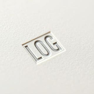
Embossed edition mark on paper corner
Emboss mark — blind deboss, low moisture.
Graphite signature with edition number
Signature — soft graphite, steady hand.
Ledger page with edition entries
Ledger — order ID ties to certificate.

Framing

Framing Quick Answers — spacing, mats, glass

Two common choices with fast rules. Open the cards for short guidance.

Mat or no mat?
Poster framed with and without a mat
Mat softens linework; 5–8 cm works for medium frames.

Mats add calm and hide tiny paper waves. Skip mats for large bold anchors where you want maximum field.

Glass options?
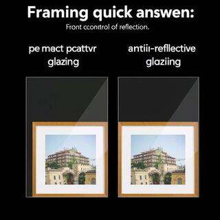
Regular glass vs anti-reflective sample
AR glazing kills room reflections; regular is fine in dim corners.

Bright rooms: choose AR or matte acrylic. Near windows: angle the frame 2–3° with felt pads.

Sketch

Sketchbook Margins — where the idea breathes

Most posters start as small decisions in a big margin. The white space isn’t waste — it’s how we listen.

Sketchbook page with arcs sitting in large margins
Arcs in margin — rhythm checked before scale.
Tiny graphite grid in a notebook margin
Mini grid — small first, then precise.

Ship

Shipping Notes — packs built for distance

We over-pack on purpose. Corners, spacers, and shock tests make sure the print arrives calm.

Frame with cardboard corner guards
Corner guards — first line of defense.
Poster tube with inner wrap and label
Tube pack — inner wrap + label for tracking.
  • Metros: 2–4 business days. Tier-2: 4–7. Remote: +1 day.
  • We replace transit damage — write within 48h with photos.
  • Keep tubes upright in storage; don’t stack on caps.

Close

A Quiet Finish — when a wall finally exhales

If a poster disappears and the room feels inevitable, we did our job. Write to us when a corner needs that feeling.

Writing desk with envelope and pencil
Write any time — short notes welcome.
Rolled poster with kraft band
Packed calm — ready to travel.