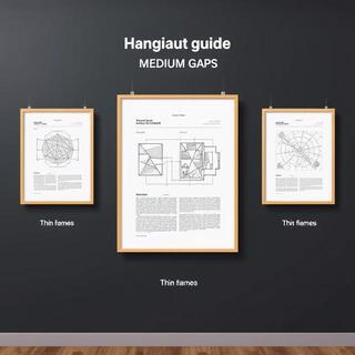
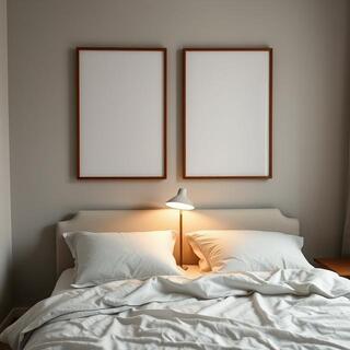
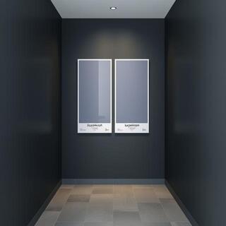
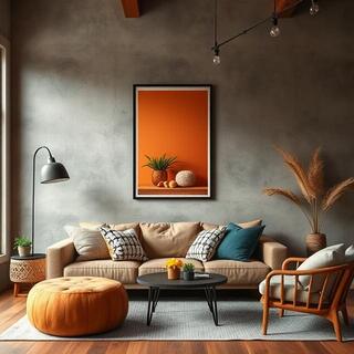
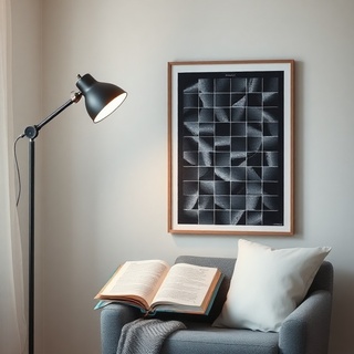
Loft Lines — Gallery Collections

Collections

Curated Series — calm lines, honest materials

A living set of series we keep refining. Each bundle balances rhythm, paper grain, and frame depth for Indian rooms — from compact rentals to airy lofts.

Minimal grid poster in a narrow frame
Minimal Grid — quiet structure.

Why series?

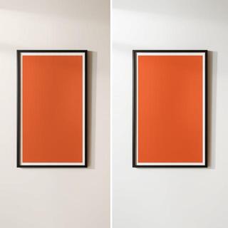
Series keep decisions simple: one visual language applied three ways. Hang as a row, a stack, or an offset pair — the wall reads intentional with minimal effort.

  • One palette, multiple tempos.
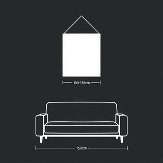
  • Easy spacing rules (4–6 cm).
  • Works with teak, steel, or paint-grade frames.
Brass curve lines over kraft tone
Brass Curve — warm arcs.
Stair-like line pattern in charcoal
Stair Lines — steady ascent.

Lab

Grid Lab — alignment that lets rooms breathe

We test spacing with paper dummies before committing to frames. The goal: enough air to breathe, tight enough to read as one voice.

Tight triptych alignment on a console
Tight triptych — 4 cm gaps for unity.
Medium gaps above a sofa
Medium gaps — 6 cm for larger rooms.
Stacked posters near a reading chair
Stacked pair — small rooms, tall read.
  • Eye line: 150–155 cm from floor to center.
  • Offset rule: if stacked, keep lower print 8–12 cm above furniture.
  • Lighting: matte papers kill glare in balcony-facing rooms.

Browse

Series Rail — glide through anchors

Swipe/scroll the rail. Each anchor pairs well with a small note print for desks and entryways.

Anchor poster with ochre grid
Anchor — Ochre Grid.
Anchor poster with midnight linework
Anchor — Midnight Line.
Anchor poster with sienna arc over kraft tone
Anchor — Sienna Arc.
Anchor poster with concrete step lines
Anchor — Concrete Steps.

Tip: for narrow entries, pick one anchor and a note 1/3 the size; keep 5–7 cm gap.

Pairs

Material Pairs — paper tones and frame finishes

Three pairings we use most often. Match paper warmth to your furniture first; the frame finish then becomes a quiet echo.

Kraft-toned poster in teak frame
Kraft × Teak — warm on warm; works with linen sofas.
Matte white poster in brushed steel frame
Matte White × Steel — cool, precise, loves concrete.
Charcoal lines in thin black frame
Charcoal × Thin Black — high contrast, gallery feel.
  • Teak adds warmth to north-facing rooms.
  • Steel frames keep geometry crisp on textured plaster.
  • Thin black frames work best when walls are mid-tone.

Light

City Light Tests — day to dusk on one wall

Drag the dial to simulate light shift. Matte stocks stay calm; semi-matte adds a subtle snap to lines in dim corners.

Room with poster under window light
Single anchor under shifting light.

0 — evening • 100 — noon

Picks

Curator Picks — this week’s calm anchors

Short rail of two strong anchors; both pair nicely with kraft notes and teak frames.

Warm arches poster on kraft
Warm Arches — sienna on kraft.
Slate grid poster with cool tone
Slate Grid — cool balance for steel.
Ink ellipse poster with soft edges
Ink Ellipse — soft cadence note.

Scenes

Room Corners — three ways to place calm anchors

Corners carry a lot of mood. A single anchor, a soft pair, or a desk note — each resets the room without visual noise.

Console in a corner with a single anchor poster
Console corner — one anchor, centered on the console width.
Bedroom corner with a calm pair above side table
Bedroom pair — echoing arcs, 8 cm gap.
Workspace corner with a small note poster
Workspace note — small frame, tall proportion.
  • Keep 12–16 cm from frame edge to side wall to avoid cramped read.
  • Use felt pads to tilt frames 2–3° and kill glare from lamps.
  • Two colors only: wood + neutral keeps line posters crisp.

Library

Shape Library — gestures we revisit often

Our posters grow from a small library of gestures — arcs, grids, threads. Tap chips to highlight families; images update with a subtle pulse.

  • Arcs
  • Grids
  • Threads
  • Washes
Arc study on kraft tone
Arc study — calm sweep.
Gesture line set with fading ink
Gesture lines — soft cadence.

Guide

Hanging Heights — the simple rules that always work

If you remember one thing: eye line first. Most rooms feel right with the center at 150–155 cm; adjust by a few centimeters for very tall or very low sofas.

Metric diagram showing eye line at 150–155 cm
Eye line — 150–155 cm to center.

Fast checks

  • Keep 8–12 cm above consoles, 15 cm above headboards.
  • Triptych gaps 4–6 cm; outer margins slightly wider than inner.
  • If glare persists, tilt frames forward by 2–3° with felt pads.
Hanging tools: tape, level, felt pads
Tools — tape, level, felt pads.

Compare

Monotone vs Duo-tone — where a second color helps

A pure graphite read is timeless; adding a sienna undertone can warm cool rooms with concrete or steel. Drag the handle to compare.

Monotone graphite poster on a cool wall
Duo-tone poster with sienna undertone
  • Cool rooms (north light, concrete) benefit from a warm undertone.
  • Monotone is safer near colorful rugs or cushions.

Texture

Paper Bench — fiber, deckle, and coating tests

We keep a running bench of texture studies. Macro shots reveal how fiber holds ink, how deckle edges read in frames, and where coating tames glare without killing depth.

Macro of paper fiber with deep black ink
Fiber depth — blacks sit snug in the tooth.
Deckle paper edge near a thin frame
Deckle edge — soft shadow against the mat.
Semi-matte sheet under raking light
Semi-matte — tames glare, keeps snap.

Stories

Rooms & Words — what people send us back

Real rooms, short notes. Texture, quiet, and a bit of ceremony when the frame finally clicks on the wall.

“The grid calms our living room without asking for attention. We lowered the lamp temp to 3000K and the blacks look kinder.”

— Kavya, Bengaluru

Customer living room with a grid poster
Living grid — soft lamp, warm rug.
Desk with a small note poster and pencil cup
Desk note — one anchor, one whisper.
“Small apartment, big calm. We went with thin black frames; the space feels taller with the vertical pair.”

— Rohan, Mumbai

Sets

Limited Wall Sets — ready-made calm for tricky walls

Three pre-balanced sets built for common scenarios: narrow entries, sofa walls, and study corners. Spacing and proportions are dialed in — just measure and hang.

Entry stack set: two vertical posters
Entry Stack — tall pair for narrow entries; 5 cm gap, centers at 153 cm.
Sofa triptych set with even spacing
Sofa Triptych — 4–6 cm gaps, total width ≈ 2/3 of sofa.
Study note set with one anchor and a small note
Study Note — one anchor + one note; keep the note at hand side.
  • Place frames first with painter’s tape; commit only after a day’s light cycle.
  • Mats soften strong linework; go 5–8 cm for medium frames.
  • Teak warms north light; steel keeps cool rooms crisp.

Workshop

Frame Workshop — corner, spacer, clean

A quick reel from our bench. Watch the active frame: we highlight a corner join, spacer gap, and the final clean.

Tight miter corner join of a frame
Corner join — clean 45° miter, no light leak.
Shadow gap spacer inside a frame
Shadow spacer — breathing gap between print and glass.
Final microfiber clean of glass
Final clean — microfiber only; no ammonia.

Care

Care Quickies — small habits, long life

Prints age well with a few habits. Keep them out of steam, dust gently, and give frames a bit of space from the wall.

Soft brush dusting a framed poster
Dust with a soft brush; wipe glass with a dry microfiber.
Small felt spacers on frame corners
Felt spacers create airflow and prevent wall marks.
  • Avoid bathrooms/kitchens unless walls are tiled and dry.
  • Run a dehumidifier a few monsoon weeks if you’re coastal.
  • Re-tighten hanging wire annually; houses shift a bit.

Color

Color Notes — sienna warmth, slate calm, coal focus

Three dependable notes we return to. Sienna warms cool rooms, slate settles busy spaces, and coal gives crisp focus to thin lines.

Living room with sienna accent poster
Sienna — soft heat for concrete and north light.
Reading corner with slate grid poster
Slate — cool calm near steel and glass.
Coal black line detail on matte paper
Coal — sharp focus without glare.
  • Pair sienna with teak or rattan; avoid high-sat reds nearby.
  • Slate reads best beside neutral fabrics or concrete render.
  • Coal lines like matte glass; semi-matte adds slight snap.

Homes

Loft Homes — three calm rooms, one language

A quick reel through real rooms: entry, living, and workspace. Watch the active frame.

Entry with stacked posters and warm light
Entry — stacked pair for a tall read.
Living room anchor above sofa
Living — one anchor, lamp at 3000K.
Workspace with a small note poster
Workspace — small note, cables tidy.

Ship

Across India — careful packs, clear timelines

We cover metros and tier-2 cities with tracked couriers. Packs are shock-tested; frames ride in padded cartons.

Simplified India map showing shipping coverage
Coverage — metros in 2–4 days, tier-2 in 4–7.
Packaging with tube and frame carton
Packaging — tubes, corner guards, padded cartons.