Graphite sequence
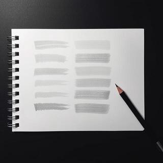
Twelve strokes, one breath. Pressure eases by thirds; edges keep a feathered bloom that reads soft from three meters. This is where our Line Study began.
Modern • Minimal • Loft
Curated wall posters and art prints for Indian homes and studios. We blend minimalist geometry with industrial warmth — designed to live beautifully in Mumbai lofts, Bengaluru studios, and Delhi galleries.

Editor’s picks
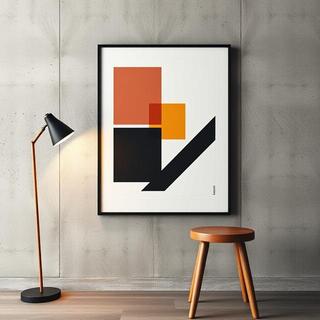
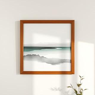
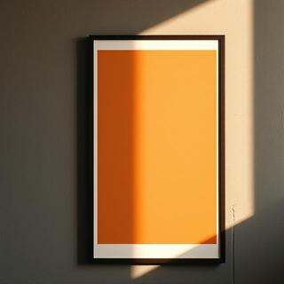
We rotate a living wall weekly. Each piece is chosen for balance: line rhythm, material grain, and how it calms busy rooms from Bengaluru to Kolkata.


Make
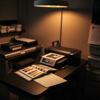
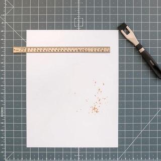
Consistency matters. We keep the flow lean: color-managed print, precise trim, and framing that protects — not hides.
Preview
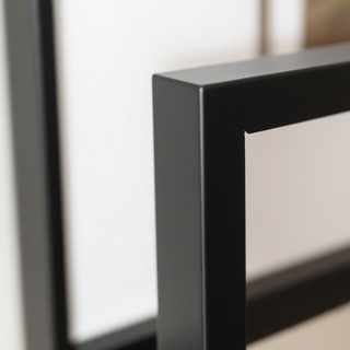
Drag the dial to simulate ambient light. Compare a room-view with a close texture and a frame corner.
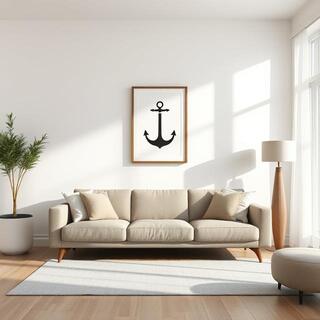

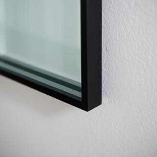
Lower for evening mood, higher for midday clarity.
Palette
Our posters carry quiet warmth. Pair sienna and kraft with teak consoles, or cool slate and steel with concrete walls. These palettes were tested in natural Indian light from Pune mornings to Chennai afternoons.
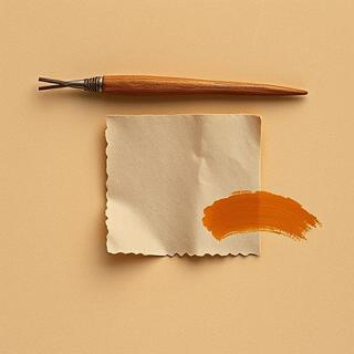
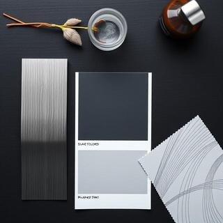
Tip: keep a 20–30% neutral wall visible around clusters; the breathing room makes lines feel intentional.
Notes
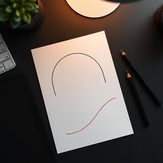
Posters start as quiet tests. We chase rhythm first: the distance between strokes, the pause before a turn, the way a line softens as ink runs out. These fragments made the final cuts.
Twelve strokes, one breath. Pressure eases by thirds; edges keep a feathered bloom that reads soft from three meters. This is where our Line Study began.

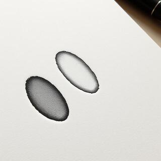
Two washes, one paper tilt. Pools settle into fiber; we lift at nine seconds to keep mid-tone air. Final poster keeps 70% of this original wash.
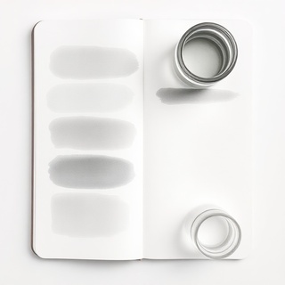
“A line isn’t a border — it’s a suggestion. Leave room for the wall to speak.”
Scale
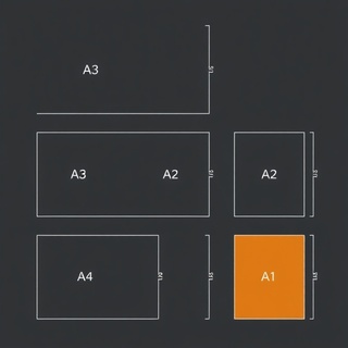
Rooms read differently at 40×50 vs 60×90. Toggle sizes to preview a wall cluster. We recommend hanging centers at eye level ~150–155 cm.

Edition
Select artworks ship as numbered editions. We sign in soft graphite, emboss the mark, and include a certificate tied to your order ID.
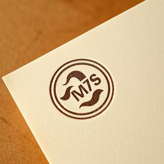
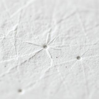
Our blind deboss mark is pressed at low moisture to avoid paper bruise. The ring carries the Loft Lines glyph and workshop code.
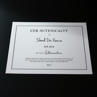
Each certificate mirrors the edition number on your print. The holographic seal maps to an internal ledger so replacements are traceable.
Guide
These are field-tested compositions for real rooms — from compact Mumbai rentals to airy Hyderabad villas. Use them as starting points; bring your furniture’s color and wall texture into the conversation.
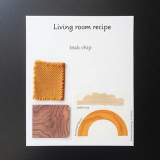
Start with a grounded rug — ochre or rust — and a low console in teak. Above it, hang a triptych of narrow posters with shared rhythm: one vertical grid, one soft ink wash, one thread-like line drawing. Keep gaps tight (4–5 cm) so the set reads as a single statement. Use matte glazing to cut reflections from TV or balcony doors. If your wall is textured plaster, choose lighter strokes to avoid visual noise.
Lamp temperature around 2700–3000K keeps skin tones warm and ink blacks natural. Avoid cool 6500K bulbs — the paper can skew blue and the graphite turns steely. If the room faces west and gets strong glow at dusk, nudge frames 1–2 cm higher to keep top lines away from light flares.
Bedrooms read best with pairs. Choose two prints that share a horizon line or echoing arcs; hang them 8–10 cm apart, 15 cm above the headboard. Linen bedding supports soft grayscale pieces; if you prefer color, keep saturation low — sienna and slate behave well under warm bedside lamps. For AC vents above, leave at least 6 cm clearance to reduce dust trails on the glass edge.
Small rooms benefit from narrow frames: 20×30s in tall proportions elongate the wall and keep the space airy. If you hear a hum from a nearby street, soft textiles like curtains and rug will deepen the quiet backdrop and your posters will appear more deliberate.
Desks get cluttered. Instead of a collage, try one anchor poster (larger, with clear geometry) and a smaller note (gesture drawing or diagram). Place the anchor slightly left of center so your dominant hand has empty visual space. Keep cables tidy; visual noise near a grid poster creates strobing. If the wall is cool grey, add a warm wooden accessory — pencil cup, frame, or lamp base — to create a color handshake with the print.
Daylight from the side is kinder to matte paper than direct frontal light. If glare persists, tilt frames forward by 2–3° using felt pads at the top corners. Your eyes will thank you after long sessions.
Care
We ship across India with shock-tested tubes and corner guards. Frames travel in padded cartons. Unpack on a clean surface — paper edges are unforgiving.
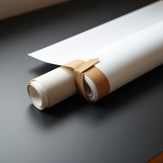
Posters ship flat for small sizes or rolled with interleaving tissue for larger formats. Tubes are crush-rated; we notch caps for pressure equalization during flights. Leave the roll to relax 30–60 minutes before framing — this prevents edge curl in the frame.

Use a clean microfiber cloth; mist the cloth, not the glass. Avoid ammonia cleaners — they can streak and dull anti-reflective coatings. For acrylic glazing, anti-static spray prevents dust cling and reduces hairline scuffs.
In coastal cities, run dehumidifiers during monsoon weeks. Keep frames off bathrooms and kitchens unless walls are tiled and well-ventilated. If a wall feels cold to touch, it may sweat at night — add spacers on the frame to create a breathing gap.
Timeline
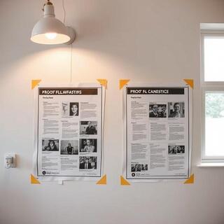
A week in our studio is a quiet loop of sketching, proofing, and making. Each step trims noise until only the essential lines remain.
On thin stock we chase rhythm — pressure, pause, repeat. Ten versions, one keeper.
Dust lifted, edges softened where needed. We keep the hand intact; no plastic lines.
Two papers tested under warm E27 bulbs and bright noon light — choose the calmer read.
ICC profiles locked; corners checked for chips. Frames wiped, glass dusted, packed.

Paper
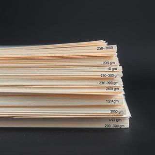
Paper is a surface and a mood. Weight stops curl, fiber holds ink, and coating decides how your room light behaves on it.
We start at 230gsm — heavy enough for flat hangs and calm edges. Larger formats get 260–300gsm to keep frames square and stop corner lift.
If your wall is slightly textured or you live near the coast, the extra weight helps the print stay true across seasons.
Cotton blends drink ink differently than alpha-cellulose. Our matte coatings keep blacks deep without glare; semi-matte adds a gentle snap to lines.
Test: hold the sheet at 45°. If light blooms softly, it’s good for living rooms; if it flashes, save it for dim corners.
Homes
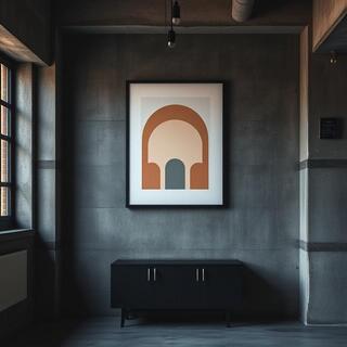
Real Indian apartments with posters that do more by saying less. Scroll the lane; each scene pairs one statement print with quiet furniture.


Contact
Whether you're hosting a gathering, curating a space, or just want to say hello — we're here. Leave us a note and we’ll get back with care and clarity.
FAQ
Short answers for the common questions. Open any item for details and quick visuals.
Both options. Unframed posters ship in tubes; framed pieces ship in padded cartons with corner guards. Frames are teak-tone or black steel.
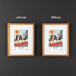
Matte stocks reduce glare and suit bright rooms; semi-matte adds subtle snap to lines in dim corners. For humid cities, heavier 260–300gsm helps keep frames true.
Nationwide via trusted couriers. Metro deliveries are typically 2–4 business days; Tier-2 cities 4–7. Remote areas may require an extra day for line-haul.
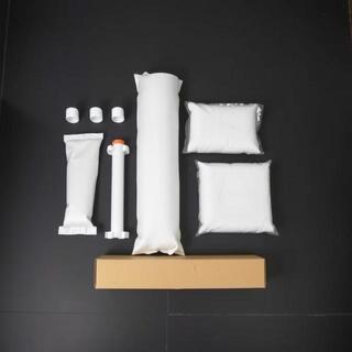
Yes within 7 days in original condition. If damaged in transit, contact us within 48 hours with photos so we can arrange a replacement quickly.